From MindMap® to i2Brain-net (page 2 of 4)
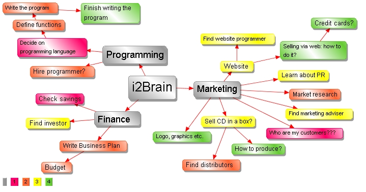
An alternative to such a FILTER is the use of colours:

The colour-legend is in the bottom left-hand corner of the picture.
i2Brain exists to show you your information from different stand-points - so YOU understand
it better.
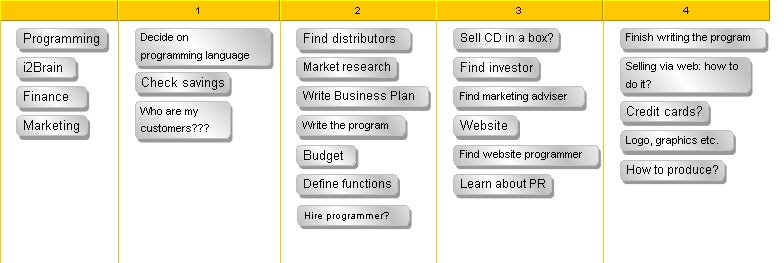
The flat tree-structure can soon become a limitation. So here's exactly the same information
shown differently:

The columns represent the 4 phases. It took 5 clicks to generate this last graphic because all the information was already in the program.
Note that it really is the same information in both views: The "phase 1" activities are red and in the column with "1" in its header, "phase 2" activities are orange or in the column headed "2" and so on.
If you drag an item from one column to another, it changes its colour in the view at the top of this page. The data exists once, and is simply SHOWN in different ways in various "views" (windows).
